Stop Using a Blank-Page Builder for Your Career Site
Stop Using a Blank-Page Builder for Your Career Site
Blank-page builders sell freedom. Drag anything. Style everything. Start from zero.
That freedom feels great—until you’re three hours into “just finishing the site” the night before an interview, staring at empty sections, a half-chosen font, and a layout that looks like every other Carrd or Wix portfolio on the internet.
Your career site isn’t a design playground. It’s a hiring surface. Recruiters don’t reward how customizable your tool was. They reward whether the link looks intentional for the role you’re chasing.
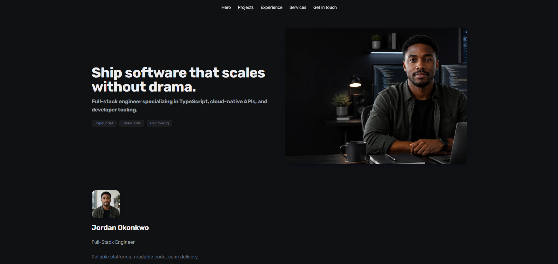
Portura starts from persona themes—not a blank canvas—so you get to application-ready faster.
Why blank pages fail job seekers
Blank templates fail in predictable ways:
- Decision fatigue. Every spacing, type, and section choice is yours. Under time pressure, “flexible” becomes paralysis.
- Generic layouts. Without a system, most people land on the same hero + about + projects stack, with the same soft gray palette and the same empty contact block.
- Empty sections as noise. A visible Skills section with nothing in it, or a duplicate Contact band under a detailed About, reads as unfinished—not minimal.
- Wrong job for the tool. Site builders optimize for any website. Job seekers need a portfolio that maps to how they actually present work: projects, proof, skills, and a clear path to reach them.
You’re not trying to invent a brand system from scratch. You’re trying to look hireable this week.
Persona themes as a starting system
Portura’s theme catalog is organized around career personas, not one-size templates. Each family ships with section order, layout presets, and color variants chosen for how that audience presents work—developers, freelancers, creatives, consultants, and more.
That means you’re editing a coherent starting point, not inventing structure under deadline. Switch a color variant to try a different mood. Change a section layout when you need a denser projects grid or a calmer résumé-style header. Keep the system; tune the details.
If you already know your path:
Browse families and variants in the theme gallery—then customize in the editor without rebuilding from zero.
Theme Designer AI: personalize without starting over
Sometimes the catalog base is close but not quite your vibe. That’s what Theme Designer is for.
Answer three quick questions—vibe, color mode, and density—and Portura clones a recommended persona base for your portfolio category, then generates colors, typography, spacing, and a small set of layout overrides. You’re not prompting a model to invent a website from nothing. You’re refining a grounded starting system against your content.
Regenerate or refine in preview before you apply. The goal is the same as the catalog: application-ready, not “I spent the weekend picking fonts.”
What to hide by default
A polished career site is as much about what you don’t show as what you do. A few product-informed habits:
- Hide empty sections. If you don’t have testimonials, certifications, or a gallery yet, turn those sections off. Visible empty bands make the whole page feel drafty.
- Avoid duplicate contact blocks. Detailed About / user-info layouts often already surface contact, location, and social links. Leaving standalone Contact, Connect, or Location sections on at the same time can repeat the same info twice.
- Let content blocks and embeds own their titles. When a section already has its own headline, hide the shell section title so recruiters don’t see the same line twice.
- Keep the menu short. A nav with every section enabled is harder to scan than a handful of strong jump targets (projects, experience, contact).
These aren’t decoration tips. They’re how you make a persona theme look finished on day one.
Browse themes, then start free
Stop treating your career site like a blank magazine layout. Start from a persona base, personalize with Theme Designer when you want, hide what’s empty, and ship a link you’re willing to put on an application.
Start free on Portura — 50K signup tokens, no card required.